by Ambrose Li
In “The Basics of Website Accessibility,” Maia Kowalski brought up an interesting topic that I believe has not been talked about for a while: “extravagant fonts.”
But what exactly are extravagant fonts?
I still remember the early days when the government of Ontario was promoting the Accessibility for Ontarians with Disabilities Act (AODA), when I would see large posters about accessibility at bus stops. The posters would show a menu – presumably of a fancy restaurant – printed in a script typeface that was difficult to read. Extravagant fonts.
But I also still remember why the menu was difficult to read: It’s not because the font was “extravagant,” but because the depicted typeface had an unusually small x-height.
The x-height is something many graphic designers know about but is probably mostly unknown outside design and calligraphy circles. It is the theoretical height of the lowercase x, not counting any “overhangs” (visual adjustments that are allowed to “go outside the margins,” so to speak). When we say a small x-height, we mean it’s small either in relation to the cap height (the theoretical height of a normal uppercase letter) or to the point size.
But how small is small? According to guidelines published in 2019 by the Association of Registered Graphic Designers (RGD), anything smaller than 67 percent of the cap height would be considered small.
Designers know that a suitable x-height is pivotal to legibility, but non-designers – including scientists– probably haven’t even heard of the x-height. This has led to some myths surrounding typefaces, one of which being the point size.
The mythical point size
Rules about point size are pervasive when it comes to accessibility. For example, the CNIB (originally the Canadian National Institute for the Blind) recommends “preferably between 12 to 18 points.” The World Wide Web Consortium’s Web Content Accessibility Guidelines, long since part of the AODA, also includes many rules related to the point size.
The problem is the point size exists only in our imagination.
No, it’s not based on reality. This “most basic dimension of all in typography,” Robert Bringhurst wrote in The Elements of Typographic Style – the North American designer’s equivalent of our Chicago – “cannot be measured from the printed letter. Strangely enough, it can’t always be found in the type metal either” (version 4.1, 2015, 301).
For an illustration, let’s take Bickham Script Pro, one of those extravagant fonts, and compare it to Times Roman and Helvetica. As you can see in the figure, although all three are the same point size, text set in Bickham Script Pro has an x-height that is much smaller (in relation to the point size). In fact, the text itself looks much smaller because of the small x-height.

Although all three samples are set at the same point size, they all appear to be of different sizes (all measurements were eyed and are approximate).
To further illustrate, let’s say we set a web page’s body text at 18 points. If we set it in Helvetica, we’d end up with an x-height of 18 ÷ 72 × 37.8 = 9.5 points (3.3 millimetres), but if we chose Bickham Script Pro, we’d end up with an x-height of only 18 ÷ 72 × 12.7 = 3.2 points (1.1 millimetres). To compensate for the much smaller x-height, we’d have to set our text in 53.6-point Bickham Script Pro to arrive at the same visual size as 18-point Helvetica.
This shows how talking about point size alone is meaningless.
This does not mean extravagant fonts always have a small x-height or sans serif faces always have a larger x-height than serif ones. For a counterexample, let’s compare Futura Script (a commercial typeface), Alegreya Sans (created by Juan Pablo del Peral et al., released 2013), and Trocchi (created by Vernon Adams, released 2012).
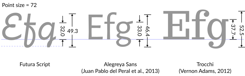
Although all three samples are set at the same point size, they appear to be different sizes even though the difference this time is relatively small (all measurements were eyed and are approximate).
So what really is the point size?
At this point you might be wondering: If the point size is so arbitrary, what, really, is it?
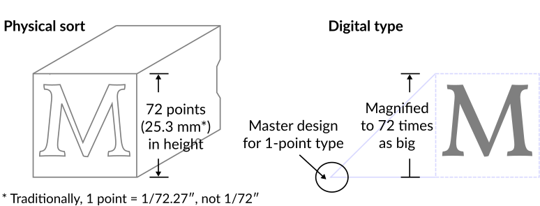
In the past, the point size was the actual height of a piece of wood or metal called a sort. So in principle, it should have been based on reality; in practice, this isn’t always the case because, Bringhurst (301) points out, sometimes designs were cast on a sort of a different size than the size they were designed for, causing the point size to not match the height of the sort.
With digital types, the point size is just how large we want to enlarge a master design, which is defined to be 1 point in size. To set text at 12 points, for example, just means enlarging some master designs so that they’re 12 times as big. Although digital designs don’t technically need to fit within a fixed rectangular surface, to avoid problems, most designs would fit more or less within the design grid, usually 1,000 units in height (Poulin, R., Design School: Layout; A Practical Guide for Students and Designers, 2018, 16).
Not just “extravagant fonts”
It’s important to remember that the issue of x-height is not specific to extravagant fonts. Times New Roman, for example, was designed with a small x-height (in relation to the point size), which is partly why text set in Times New Roman appears smaller.
My advice to anyone who cares about accessibility in relation to typography is to always take accessibility guidelines with a grain of salt. Try to follow them, but be skeptical.
I would recommend anyone who wants to know more about fonts and accessibility to check out the second edition of RGD’s Access Ability (19-32). It’s a free download (also available as a free printed book) that contains a whole section that’s relevant, and it’s written from the designer’s point of view.
Note: All illustrations are the author’s own work, originally created for the Cantonese Wikipedia under the author’s student name at OCAD University. The second type analysis diagram is a new adaptation of the first, specifically created for this article.
Ambrose Li copy edits for Studio magazine and also freelances.
This article was copy edited by Word Crisper, a journalist who also edits for businesses.
